Why agents should consider brand colours when marketing to clients
Colour psychology consultant and trends forecaster June McLeod explains the importance of colour when agents are building a new brand, or rebranding an existing business
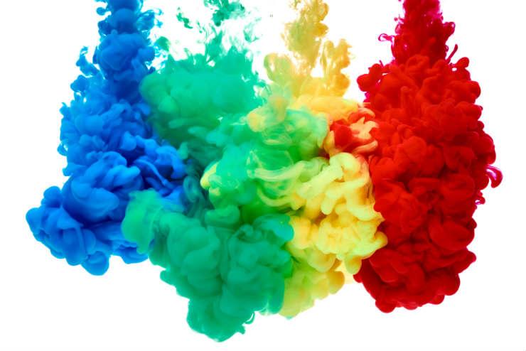
Colour is a vital element of any brand’s identity. To prove my point, think of the most iconic brands in the marketplace today, and their colours are recognised instantly: Cadbury’s purple, Coca Cola’s red, Sainsbury’s orange and The National Trust’s green.
Just as it takes more than a carrot and a piece of coal to make a snowman, it takes a strong combination of colour and design to create a lasting brand. The right colour/s can attract success, or just as easily alienate the target market.
It is worth remembering that each colour has a dual personality, and holds within it positive attributes and negative attributes, so for balance and a fuller expression of meaning both need to be recognised and utilised by a colour psychologist for an instant and powerful impact.
Colour associations can be historical, national, cultural, personal, linguistic and visual. With more business being done beyond national and continental boundaries, understanding the fundamentals of colour associations can make the difference between you and a competitor who doesn’t know or care.
Colours for the travel industry
There can never be “right” colours for each industry sector, especially when brands today are sitting both online and on the high street, making them totally different from a colour perspective.
However for travel firms, the areas they specialise in will determine the colour scheme. For example, a Mediterranean cruise specialist or firms offering packages to hot climates will concentrate their colour choice from coral, blue, green and teal. Or ocean colours supported by a grounding and earthy green palette, all brought together with cream or taupe.
Winter sports travel firms will endeavour to choose colours from the warmer end of the spectrum, inviting customers to warm to the theme of skiing and winter fun in the cold.
Those offering a wide array of world travel will combine their selection with a choice from the warmer end of the spectrum – red, orange, yellow and green – with the cooler end of the spectrum – blue, indigo, purple and again green – and include either black, grey or gold to pull them together to showcase their wide appeal and knowledge of world travel.
Interior decoration options
If agents are redesigning the interior of their shop, the colours they use are so important, as it has been proven that colour affects mood.
The choice of colours will depend on the placement of the building, and the light permeating it. I personally carry out a full survey of the building and light before I commence choosing the colours for decor.
The whole spectrum of colours can be used to make people feel happy and positive when placed correctly, and even grey can work its magic.
The most popular happy colours are scarlet red, deep pink, light and bright orange, sunshine yellow and fresh green.
Relaxing colours are any from the blue range, teal selection, dove grey, soft pink, pale yellow, taupe, autumnal colours and cream.
Every colour can be chosen to be inviting, and again it is the shade of colour that is vital to success wherever colour is placed. Fresh green and cream or dove grey with either soft blue, soft yellow or soft deep pink are nice welcoming colour combinations.
- McLeod is the author of Colour Psychology Today; colourpsychologytoday.com
You might also like: What to consider when planning a rebrand

